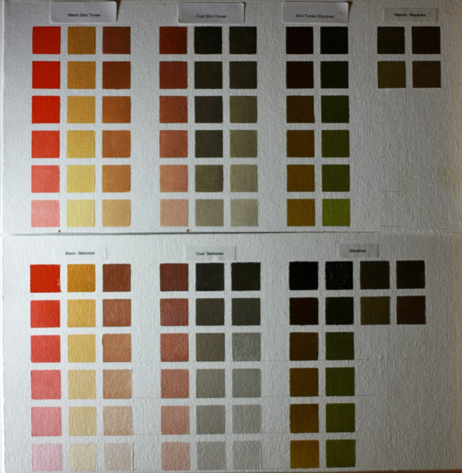
I made two charts of the same palette. One using Flake White (top chart) and the other using Titanium White (bottom chart)
I made the charts to help me choose the kind of white for a given color. It is evident that flake white is the better one for skin tone mixtures because its warmer and does not shift the hue of a mixture towards blue like titanium does.
That is not to say that titanium white is bad for portraits. Titanium has it's uses and the chart shows that for the right light conditions.
Enjoy
Here is a closeup with a better lightening and camera setup

No comments:
Post a Comment