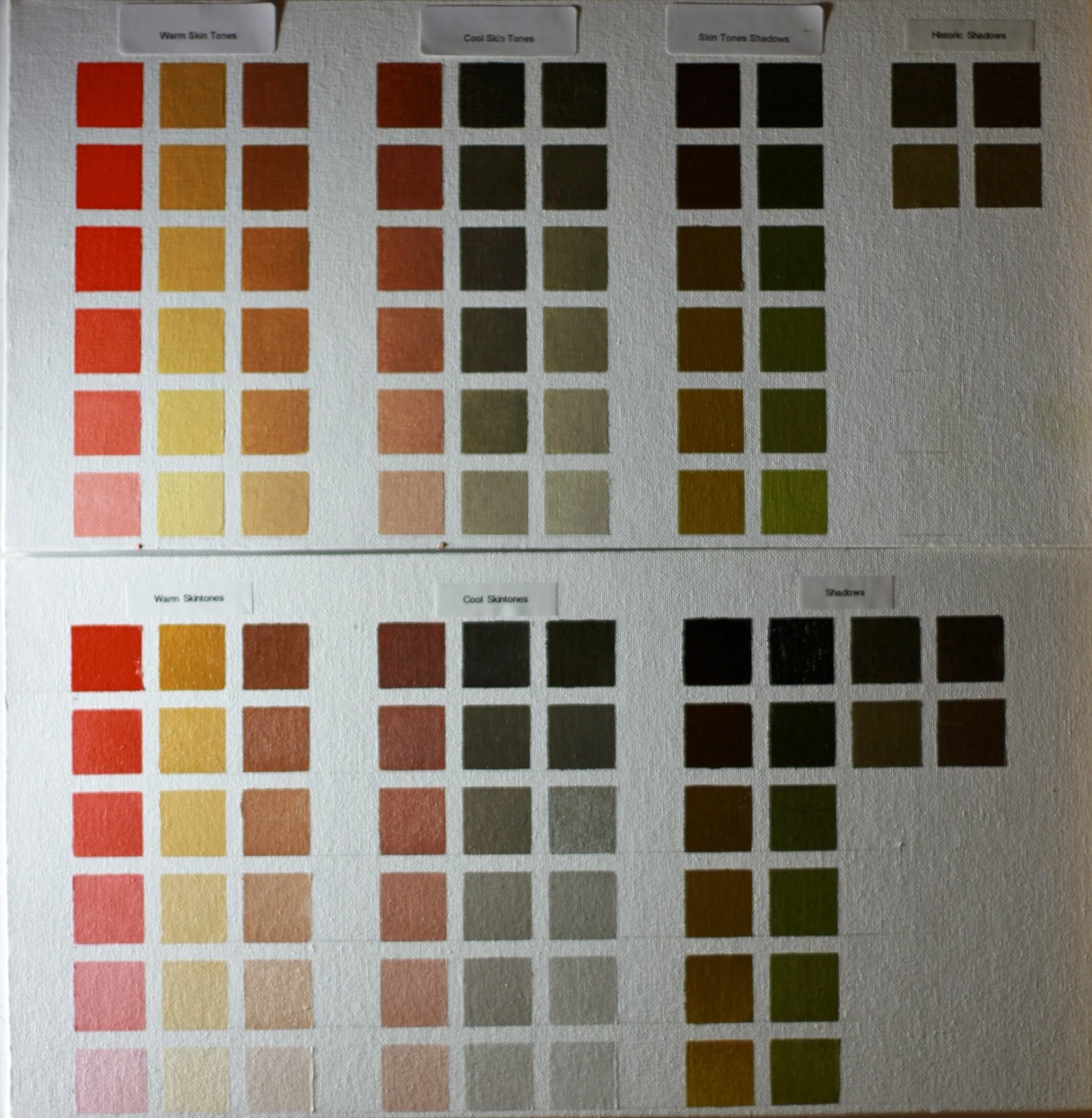
Today, I bring you the famous skin tones palette developed by artist Daniel Greene.
I made two charts of the same palette. One using Flake White (top chart) and the other using Titanium White (bottom chart)
I made the charts to help me choose the kind of white for a given color. It is evident that flake white is the better one for skin tone mixtures because its warmer and does not shift the hue of a mixture towards blue like titanium does.
That is not to say that titanium white is bad for portraits. Titanium has it's uses and the chart shows that for the right light conditions.
Enjoy
Here is a closeup with a better lightening and camera setup
K. AlHajri Oil Painting Blog
My Work-In-Progress and Art Supplies Reviews
Tuesday, February 18, 2014
Sunday, February 16, 2014
I have been experimenting with limited palettes for painting in oils. I have chosen a Rembrandt Oil paint brand of Yellow Ochre, Transparent Oxide Red, and Ivory Black in addition to Titanium White.
Here is what the color swatches of that limited palette came out with.
I'll do some landscape studies with it and post the result.
Here is what the color swatches of that limited palette came out with.
I'll do some landscape studies with it and post the result.
Wednesday, March 14, 2012
Started adding background

Last night, I started with the background. I have used a mixture of Transparent Oxide Brown and Ultramarine Blue for the darks and gradually lightened it by adding more Winsor & Newton Liquin to the mixture.
This morning I came back to the painting and thought of wiping some of the light area with a rag to make it lighter and have the canvas weave show a little. I'm still deciding if I should keep it or hide the canvas weave.
Monday, March 12, 2012
Finished Umber Under-Layer
Wednesday, February 29, 2012
Rose in Clay Pot with Lapis and Green Apple. WIP

I've started a new still life painting yesterday. I choose for the setup a collection of natural and man-made objects. A rose inside a traditional clay pot, two pieces of lapis lazuli in a woven basket and a green Apple.
The arrangement was done in a controlled light environment to give the still life a dramatic look.
The first step was to transfer the drawing using charcoal powder and then draw with ink over the transferred lines. I've used sepia sennelier ink.
I'm in the process of adding an underpainting of Old Holland Burnt Umber and Cremnitz White to indicate the darks, halftones and lights.
Labels:
Clay Pot,
Green Apple,
Lapis Lazuli,
Rose,
Woven Basket
Subscribe to:
Comments (Atom)


